Paragon
The product: Platform improvements for Paragon, a B2B web design agency startup.
Challenge: To scale a mobile-first interface to desktop while designing a user journey that converts potential leads into actual clients.
Project duration: 3 months.
Deliverables: Audits, Lean Usability Testing, Information Architecture, UI.
Role: Product Designer.
The problem
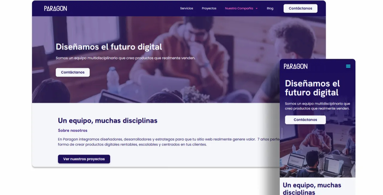
When I joined the project, Paragon had built a mobile-first website. However, their analytics revealed a critical mismatch: the vast majority of their traffic came from desktop users, where the interface was unresponsive. Furthermore, as an early-stage agency, they needed a compelling way to differentiate themselves and capture leads.
Lead-Generation
I conducted a competitive audit of 5 direct and indirect competitors to evaluate their lead-generation flows. I discovered that their initial touchpoints caused major friction, typically resulting in:
Static Phone Number:
Some agencies simply listed a phone number, leaving the effort entirely on the user with no clear next steps.
Long waiting:
Users would register their emails or were redirected to chat apps but had to experience long wait times for a human reply.
💡 Some competitors offered direct meeting links. I initially proposed this, but after aligning with stakeholders, we concluded it was too "high-commitment" for an early-stage startup.
The solution
-
A responsive Design: Adapting the interface to support desktop traffic.
-
A lead-generation flow: The goal was to offer value first and keep the user informed with clear next steps.
Responsive Design
To adapt the mobile-first platform into a desktop experience, we focused on spatial usability. We transitioned from vertical mobile stacks to horizontal grids. This use of space allowed us to display more content simultaneously:
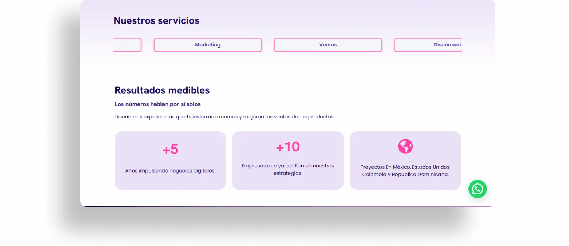
I transionated from narrow, stacked mobile layouts to wider horizontal formats that ensured comfortable reading proportions on desktop screens.
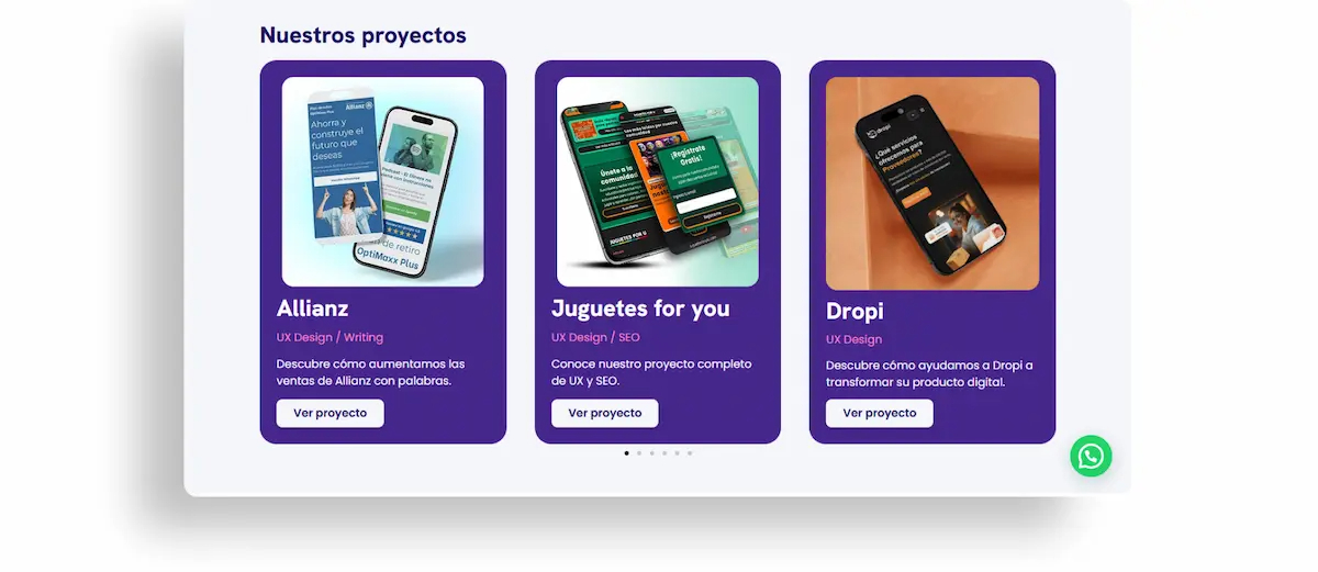
I reorganized the carousel to display three cards simultaneously, what improved the visual flow for desktop screens. Additionally, I adapted the buttons from full-width mobile stretch sizes to fitted proportions designed for mouse clicks.
Lead-generation flow
We structured the user journey into four clear steps:
1. User Entry: The potential client lands on the website via a targeted ad or direct link.
2. The Hook: Users are presented with standard contact methods (WhatsApp, phone, email) alongside a form designed to capture their website's current pain points.
3. Data Capture: The client completes the questionnaire and instantly receives an automated confirmation email.
4. Value Delivery: The client receives a Site Health Report.
Design Choices
The form: it is strategically designed to collect key information about the user's current website:

The Site Health Report: To ensure the report was both visually impactful for the client and time-efficient for the agency to produce, I designed a standardized template in Figma focusing on the next points:
-
Scalable Components: To speed up the agency's workflow and ensure easy duplication.
-
Traffic-Light Scoring: I used a visual Red/Yellow/Green scale with interchangeable bars to make complex data easy for clients to digest.
-
Visual Consistency: Aligned with Paragon’s design system to maintain a connected experience.
-
Interactive CTAs: Embedded a clickable Calendly button and social links directly within the report to drive action.


How did it work?
The new flow is currently live and serves as Paragon's primary lead-generation tool. The "value-first" strategy proved successful: the agency landed its first three clients directly through this funnel, with each lead successfully converting after receiving and reviewing their personalized report.
Learnings 🌱
This project taught me how to adapt in a fast-paced startup environment. Due to tight deadlines and stakeholder constraints, I had to break away from the traditional "wireframe-first" mindset. Instead, I learned to design and iterate directly in high-fidelity within the live platform.