PolyPool
The product: PolyPool is a collaborative savings tracking app designed for the shared goals of friends and family.
Challenge: Design an intuitive app that removes the complexity and distrust from digital financial tools, and improves the experience of saving in groups.
Project duration: 4 months.
Deliverables: Research, Wireframes, Prototypes, Usability Studies, and UI.
Role: Researcher and Product Designer.

Who am I designing for?
To start the research phase, I had to understand who the product was for:
-
The everyday Mexican who is interested in saving money for shared purposes.
💡I knew I had to contact participants of various ages, genders, and abilities to really grasp their pain points and understand how I could help.
Pain Points
After 8 interviews with participants, synthesizing the data allowed me to identify key pain points:
Group disorganization:
Interviewees perceive group disorganization as the main factor that prevents them from achieving ambitious shared projects.
Complexity:
Interviewees find financial tools too confusing, hard to learn and difficult to use across different devices.
Lack of collaboration:
Interviewees described the process of managing savings for large groups of people as ‘chaotic’, due to a lack of commitment and collaboration
Distrust:
Users are wary of handing their money to new financial products and distrust apps that do not provide clear access to the progress being made.
The solution
After analyzing these pain points, the path forward became clear. I needed to design a solution that tackled the problem on two different levels:
-
Improving the experience: A tool that structures group efforts, keeps everyone on the same page, and motivates collaboration.
-
App Foundations: An approachable and trustworthy tool.
Personas
I developed two personas to represent the main roles within the app: Mary, the proactive organizer acting as treasurer, and Lucy, the contributor seeking transparency.
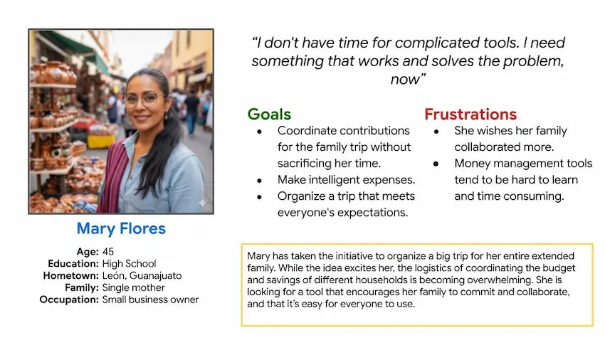
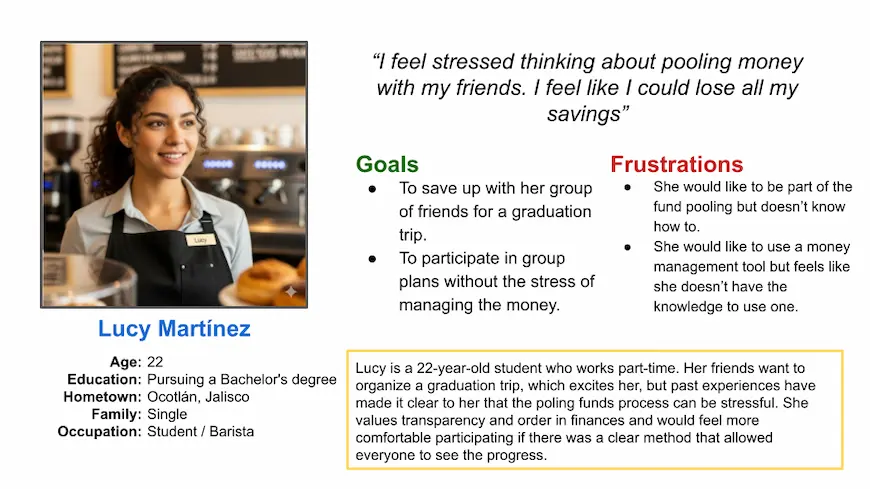
The value of a treasurer: Users trust a familiar face over a new system. Designing the app to track payments through a designated treasurer while offering access to the rest of the members became a core step for an adoption strategy.
Competitive Audit
I compared two different features (the creation of a new collaborative savings goal and the payment method) from direct and indirect competitors to find gaps and opportunities.
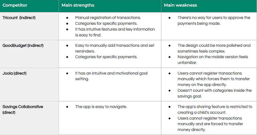
Gaps and Opportunities
-
Manual Registration: Allowing members to log their own external payments acts as the initial adoption strategy to build trust.
-
Savings Categories: Introduce a "categories" option within the savings goal, a feature competitors currently lack.
Starting the Design
Ideation
I used the 'How Might We' (HMW) method of ideation and rapid sketching techniques, such as Crazy Eights, to generate design ideas. The storyboards were also instrumental in visualizing the user flow within the app.


Paper Wireframes
Taking the time to draft iterations of each screen of the app on paper ensured that the elements that made it to the digital wireframes would be well-suited to address user pain points. I prioritized a clean, intuitive design.


Digital Wireframes
As the initial design phase continued, I made sure to base the screen designs on the findings from the user research.


Low-fi Prototype
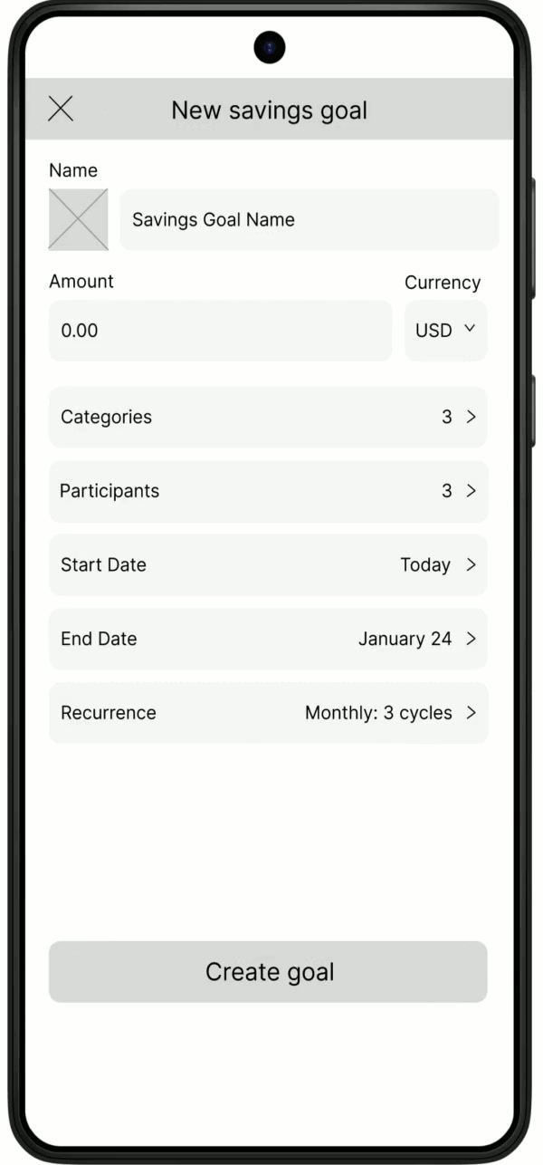
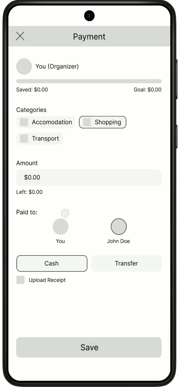
The user can progress through the sign-up screen, create a new savings goal, and register their first payment.
Usability Study
I used open-ended questions to gather the participants' perception and identify pain points. Furthermore, they answered the Standard Usability Survey and the prototype had a final score of 8.6, exceeding the passing benchmark.
Findings:
-
Users found the process of creating a new savings goal quick and easy to understand.
-
Users experienced friction on the 'Payment Registration' flow due to poor button discoverability and unclear labeling.
Refining the Design
Mockups
During this stage, I elevated the designs to high fidelity and also applied the respective changes driven by the findings from the usability study.

Users had to scroll down to find the "Submit Payment" button, which caused friction. By relocating it the primary action is now accessible without scrolling.

The screen felt confusing due to vague labeling and a disconnected input flow. I applied conversational writing, removed redundant data, and used color hierarchy to build a logical payment flow.
Design Choices
I utilized Google's Material Design system as the foundation for PolyPool's UI. Relying on an established design system allowed me to design more efficiently.

While Material Design provided an efficient visual foundation, PolyPool's features required custom, scalable solutions. I started building a component library for the app's core elements:

Both cards stem from a single component. By leveraging Figma properties like instance swaps (icons/avatars) and booleans (toggling text or arrows), the design remains scalable.
High-Fidelity Prototype
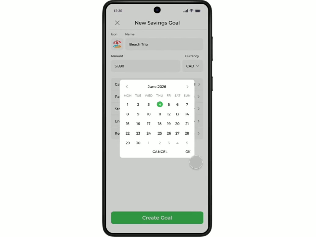
The high-fidelity prototype is now complete and queued for a second round of usability testing to validate these design iterations.
Google UX Community
Sharing my progress and iterations openly allowed me to grow as a designer. Here is some of the incredible peer validation the project received along the way:
"I'd love to have an app like this"
UX Designer
“The app design is clean and very useful"
UX Designer
Learnings 🌱
This project taught me the value of being a versatile designer capable of shifting roles across different stages of product development. The most important lesson, however, was learning to detach from the idea of a "perfect first draft" and fully embrace user feedback. I now understand that design is not a linear path; products are living entities that evolve, and continuous iteration is the only way to build a successful solution.